
 This map made the rounds of my social media and email last month. Several different economic developers picked up on the opportunity to tout their positive growth, and sometimes to take some not so subtle digs at their neighbors/competitors.
That’s nothing unusual and all’s fair I guess. What interested me, though, was how differently this visualization was interpreted.
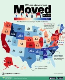
This is the link to the original study, that gives a specific explanation of what it really means
This data speaks to net migration loss or gain, meaning people who moved into the state compared to moving out of the state as estimated by a moving company. It is expressed per 10,000 inhabitants.
Some people said that the numbers represented the % increase in migration – that’s not what it says.
Some people said the number represented the net increase in population – that’s not what it says, especially because it does not factor in natural growth or decline in population (births versus deaths).
Some people interpreted this to mean that the numbers represented an increase in the workforce, but there is no detail regarding age or employment status.
The call outs on the graphic are a bit misleading as well. The actual study shows a correlation between cost of living, but doesn’t prove causation, thought the New York call out says otherwise.
Stay credible out there.