


A Place I’ll Remember – June 2026
A Place I'll Remember The ConnectUS Digital Skills Hub was launched by Smart Columbus last year with the intention of bringing digital literacy education and devices to 10,000 residents by the end of 2027. Building on a pilot first launched...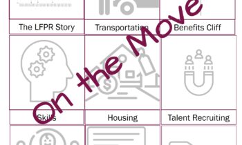
Resource Catalogue on the Move
Kate McEnroe On Demand The Workforce Participation Resource Catalogue is on the move. Those of you have already secured access should have received an email with your new credentials. It’s a simplified login process, a better look,...
A Place I’ll Remember – May 2026
A Place I'll Remember The school year may be close to an end but teachers are on my mind this month. According to the Learning Policy Institute one in eight teacher positions at the K-12 level are either unfilled or filled by individuals...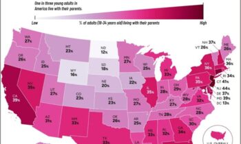
Causation or correlation?
Redesign Your Data Here I go again. Another great visualization with data displayed accurately, but great opportunity for misrepresentation. Some commentary accompanying the map suggested that higher costs of housing and living is the...
Look to the Left, Look to the Right
Uncategorized View to the left, view to the right from the Dublin mid-rise apartment building where I’ll be living for the next five months. For economic development and real estate nerds, our location is really fascinating....
A Place I’ll Remember – April 2026
A Place I'll Remember Economic developers have been urged to hone their storytelling skills for years. In Indianapolis, the Chamber is reaching out to crowdsource stories from throughout the region as part of the INDY: I’m Not Done Yet...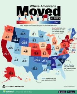
Stay Credible
Redesign Your Data This map made the rounds of my social media and email last month. Several different economic developers picked up on the opportunity to tout their positive growth, and sometimes to take some not so subtle digs at...
Are Data Centers Funny?
The Distillery Need some comic relief from all of the AI data center drama? Don’t judge, this is a guilty pleasure I came across and suddenly – OK, not so suddenly – there was a story arc about an AI data center...