
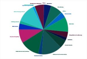
 This is a visualization of a pretty typical economic development data set – employment by industry.
Is it hard to read? Do you think it would matter if I enlarged it? Made it in another program? Well, maybe, but the problem is more fundamental than that. Data visualization experts have a real issue with the way many of us use pie charts. Many advise that two to three slices are the limit to what the human brain can distinguish. Even the Excel “recommended chart” that popped up when I made this graphic didn’t include a pie chart.
Can you really tell which slice is largest? Sure, you could add the percentage labels, but that’s only more clutter. You could create a legend instead of the text labels, but the back and forth doesn’t really make it more readable. And please, don’t go the 3-D route.
For many of us, graphics were created some time ago, or imported into our collateral and web sites from some other document, and they aren’t what we would intentionally create today. Now we know better, and have better, cheaper, faster tools, so take a look through your stuff and see what you can do. Want some ideas for better alternatives? Makeovers are one of my favorite things!