
 We are living in a world where 3-D has become so boring it’s time to move on to the meta-verse, but our human brains still process statistics best in good old-fashioned 2-D. Excel offers 3-D options for many of their chart and graph options, and some of our favorite data providers use this format in their pre-designed reports. Nevertheless, resist the impulse. It’s not really fancier, it’s just more confusing to interpret.
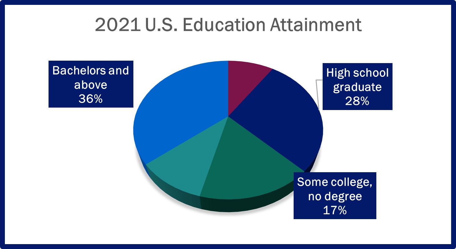
Take a look at the pie chart. I’ve even simplified it by consolidating some of the typical “slices” so that the labels area readable at all. Just looking at it, without the labels, could you tell that there is a 11-percentage point difference between High School Graduate and “Some College, no degree” (the dark blue and the dark green)? How about comparing the dark blue to the light blue – that’s an 8-percentage point difference, less that the difference between the first two. Does it look like that?
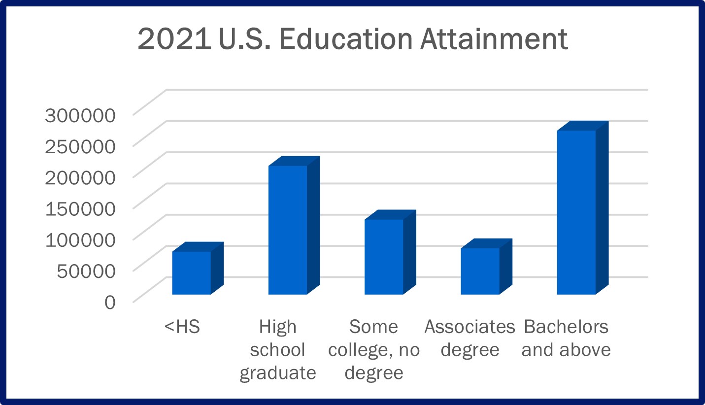 Even in column charts there are problems. Should you be comparing the front corners (the light blue face) or the back corners (the dark blue face)? Sure, you can always include labels, but that’s just clutter in service of bad design, so why not just fix the design?
When I write these posts, I’ve checked out my instincts against available research. If what I say seems wrong to you, or if you want more backup to make the case, reach out to me and I can connect you with more resources.
Or, if you want to just take my word for it, skip the 3-D and choose clarity over decoration.