
 I have a real love-hate relationship with these bubble charts, at least as they are commonly seen and used in economic development. OK, really, mostly a hate relationship. That’s not because they are a bad way to visualize data, per se, it’s because they are so frequently used for the wrong audience.
The most common data you will see on these bubble charts displays industry clusters, plotting their relative prevalence in an are (the location quotient) against growth in local or national employment, share of local employment, wages, or any number of other variables. In fact, I could argue that they could be use more, with more variables.
They are very useful tools for Analysis of a local or regional economy. Your consultant did not do a bad thing if they included these charts in your strategic planning, SWOT analysis, or target industry analysis. With some time and attention, they can be useful tools to focus marketing activity, to set expectations about growth opportunity, and to identify vulnerabilities. They have a place in a planning document and in a thoughtful, sleeves-rolled-up internal discussion.
What they are not, though, are good tools for Marketing and Sales presentations. They are often quite crowded and hard to read and interpret in the context of an overview presentation or a web site page directed to site seekers. They are not good charts to throw up on a screen briefly and move on. In fact, I’ve often seen them bring the rhythm of a good presentation to a halt because the presenter isn’t sure what point they are trying to make, other than to describe it as a picture of the economy. There are usually one or two in the audience who want to stop, zoom in, magnify, while many others just tune out the (visual) noise.
Here’s the exception, as I see it. 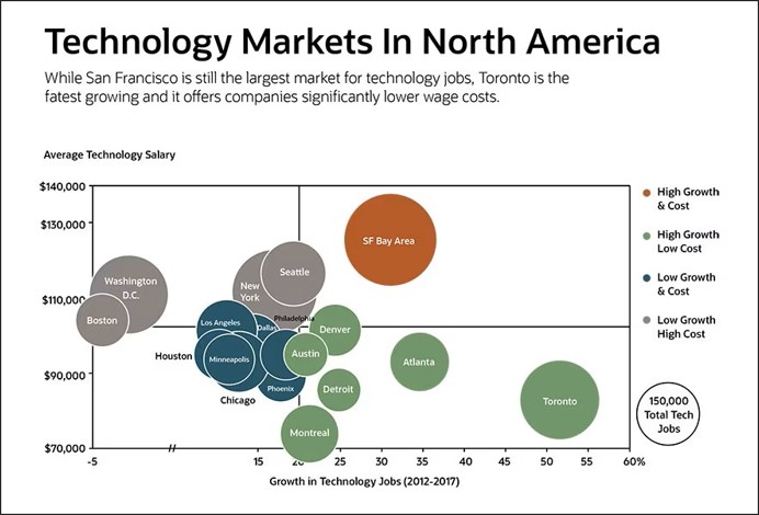 They can be interesting to show differences between places – this is an example from a Net Suite article covering a lot of good information about how to use them.
Can titles fix it? Maybe, but there are probably better options to break it down and make your point. Not sure what your point is? That’s the point of this post.