
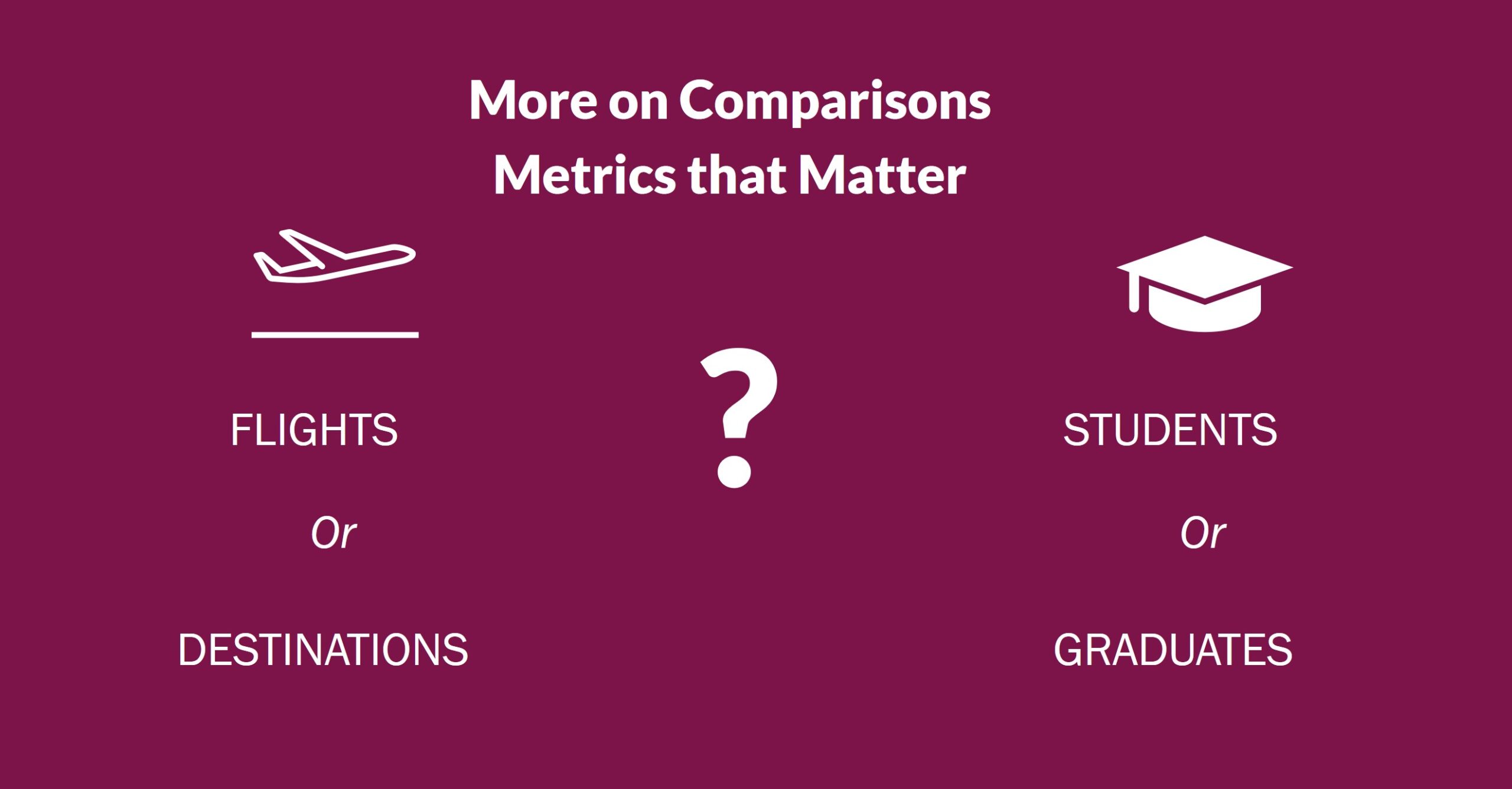
 More thoughts on visualizing community comparisons for economic developers – can you guess which I prefer? For air travel, maybe it depends on your circumstances, but in general I’d say if you are a smaller area emphasizing connectivity it’s stronger to display the number of destinations that than the number of flights. If you are putting the emphasis on multiple flight to a single destination, you are really talking to the same people over and over – the ones that need that destination. If you put the emphasis on broadening your reach of destinations, even with infrequent service, you are also broadening the number of people who care.
The student versus graduate question is an easier one for me – it’s graduates for sure, ideally with some breakdown of their field of study. Most people who research are pretty familiar with the fact that not all students graduate, and not all graduates will be a fit for their business. In fact, really large student populations may raise another whole set of questions, like the impact on workforce housing. Does this mean the numbers you post may be smaller? Yes, but it also means you are shifting the conversation toward outcomes, and that’s not a bad thing.
What are some other examples?
Let’s take weather. Instead of focusing on temperatures, either to emphasize the warm or minimize the cold, how about reporting on weather related closures of schools and airports, which are the things that really have a negative impact on businesses and their employees?
Or housing. Instead of just the median price that databases provide but no one really spends on housing, how about an approach that links a specific price point to an example of what it will get you in the local market?
I know, in some of these examples it make the job harder because you can’t just pull a number out of a data provider’s report. I’m also pretty sure it will increase your chances of getting that “wait, what???” response you are looking for.