
I’ve been reading and making a lot of charts lately , and it’s made me remember the limitations of legends. This is another area where the default settings on your spreadsheet program may not be serving you well.
My economic development friends always have lots of data to display, but whether it’s data over time, or county by county, or cohort by cohort often it’s not long before the legend gets out of control. When there are this many “series” it’s almost impossible to maintain your brand color scheme. More importantly, you are asking your reader to ping-pong their eyes from one side to another or up and down and it’s just hard to track. You see it in bar charts, but also in line charts, bubble charts, wherever there are lots of data points and lots of categories. Take a look at these beauties.
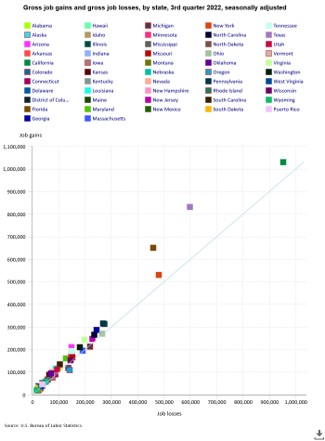

Nobody wants to squint and swing their eyeballs back and forth, and it’s really difficult to decipher the trends or the messaging in these charts.
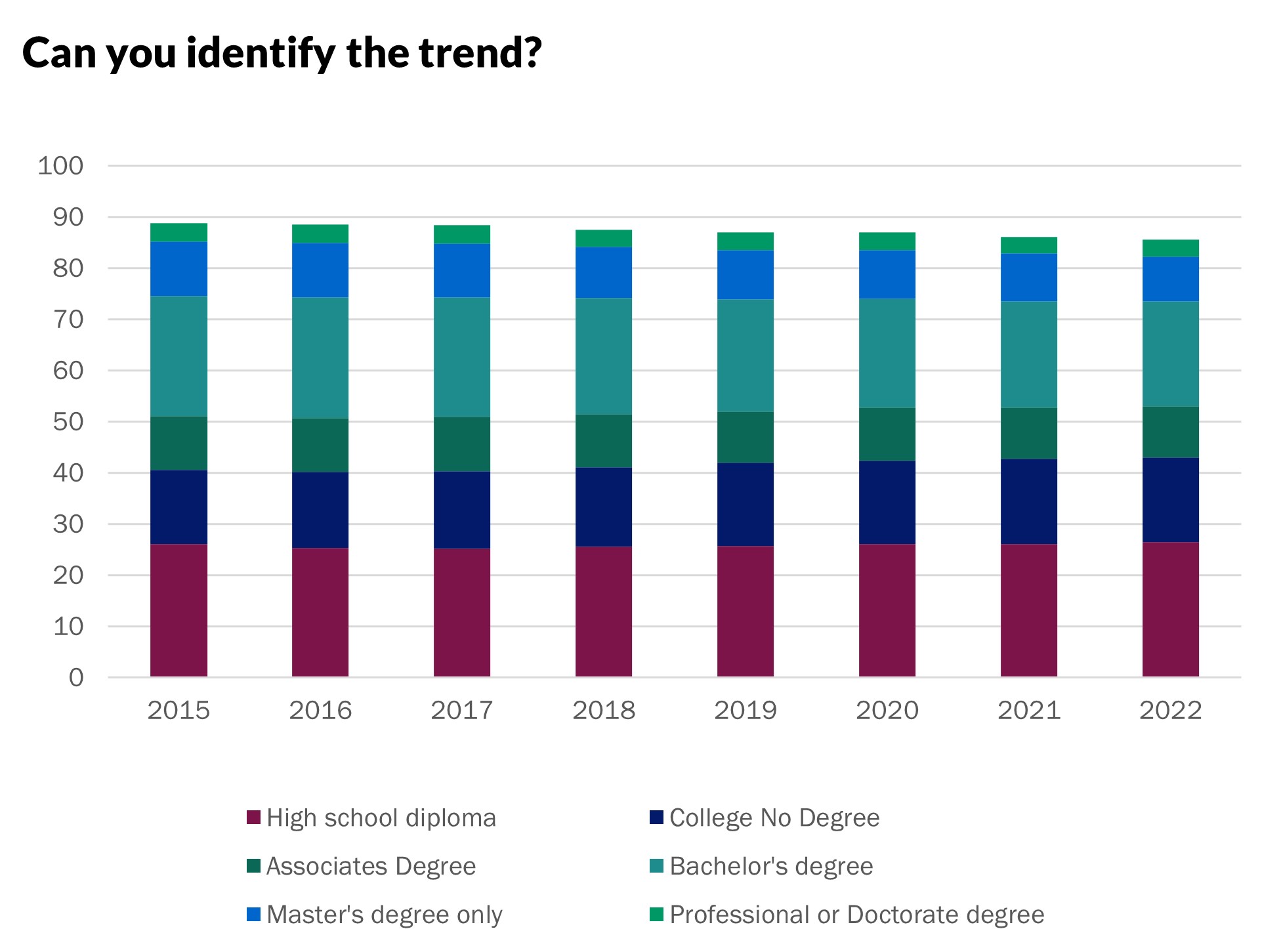
If your legend starts to look like this, I have a couple of thoughts. You might be getting too granular with the data. Take a look at this bar chart of education attainment. I think it’s still too cluttered even with the reduction in categories. In fact, unless I am talking to educators, I’d probably break it down to no more than four.
Even better, do that and then consider labels instead of legends (you can do it in any desktop program though it’s not super obvious). That’s what this second line graph looks like.
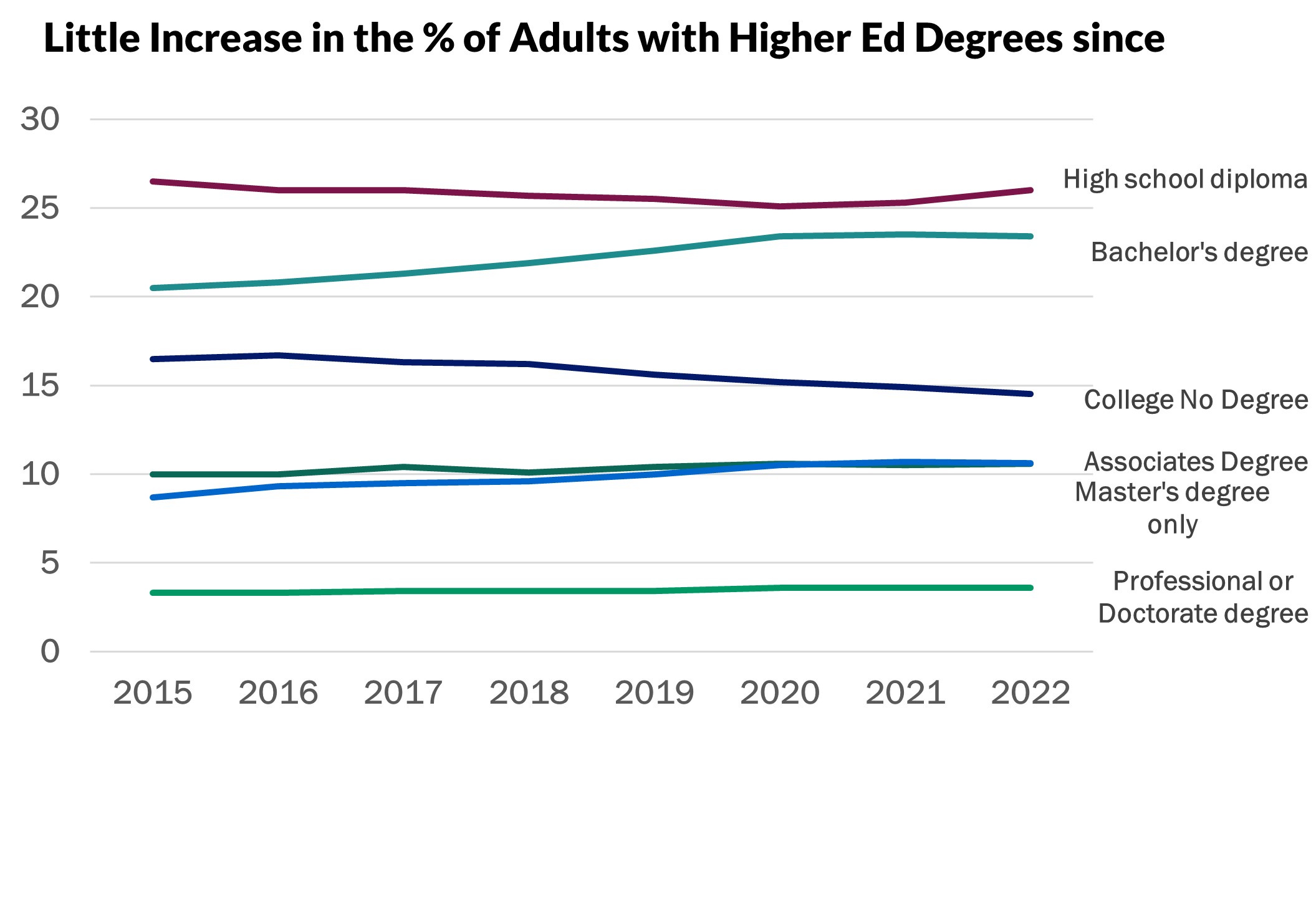
You can even animate it to reveal by category if you are presenting – yes, all in Excel, no new software or specialists required just a little tutorial in direct labeling.