
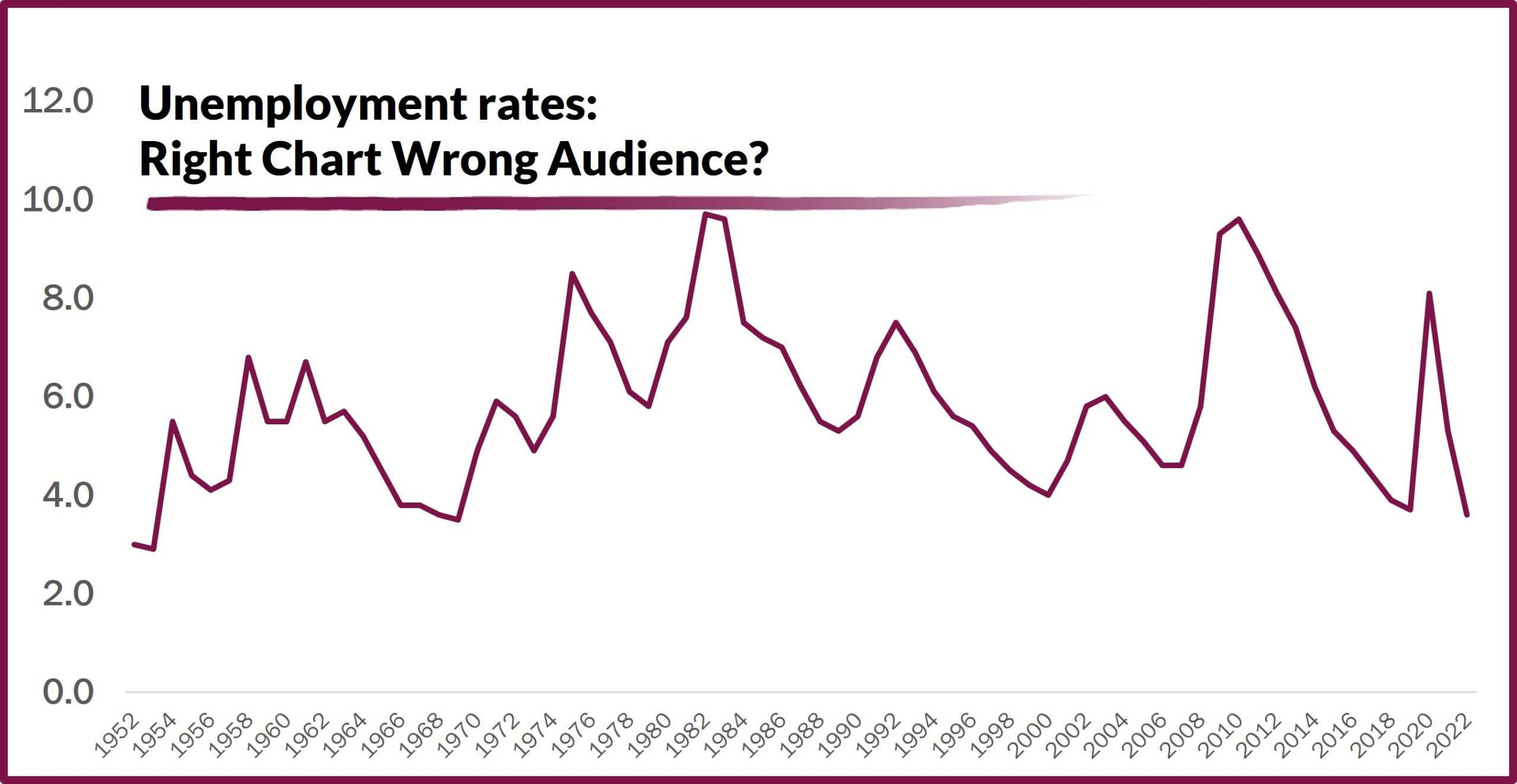
 If you are working with data visualizations for economic development, remember that the perfect design isn’t perfect if you use it with the wrong audience. Take unemployment – a downward trending graph, record low rates, that’s good news for internal stakeholders to celebrate, and it might just draw in some talent looking for local opportunities. It makes sense to have it front and center in messaging to those audiences.
Site selectors, though might have a different reaction. There’s no hiding your unemployment rates from the serious prospects, but be prepared for them to view that same downward trend or record low with concern. Even if a graph like this it isn’t included in your presentation, your proposal, or your marketing collateral, what should be included is your answer to the question – with rates this low, what strategy works to find and keep a strong workforce in your community?