
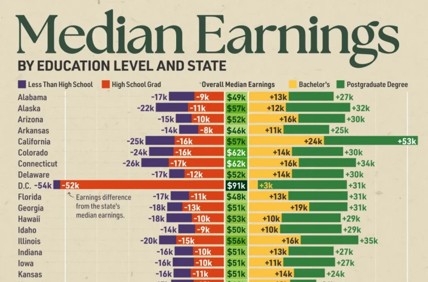
 This visualization is a perfect example of one that can be true, but troublesome.
Those of us in economic development know how much is left out of this chart, and how often we have had to explain what is left out.
The fact that there is huge variation in earnings depending on college major.
The fact that leaving out the category of “some college” or “associates degree” or “certifications” obscures other paths to higher earnings.
Some visualizations work for you, and some just give you more work to do.