 I’ve been thinking a lot about Labor Force Participation Rates in preparation for a couple of workforce class sessions I’m preparing, and as we nerds do, I got to playing with the data. As I was looking at the stats going back to the late 1940s, I remembered what a lot of experts have to say about one of the easiest ways to lie/lead with data – play with the axis, the Y axis in particular.
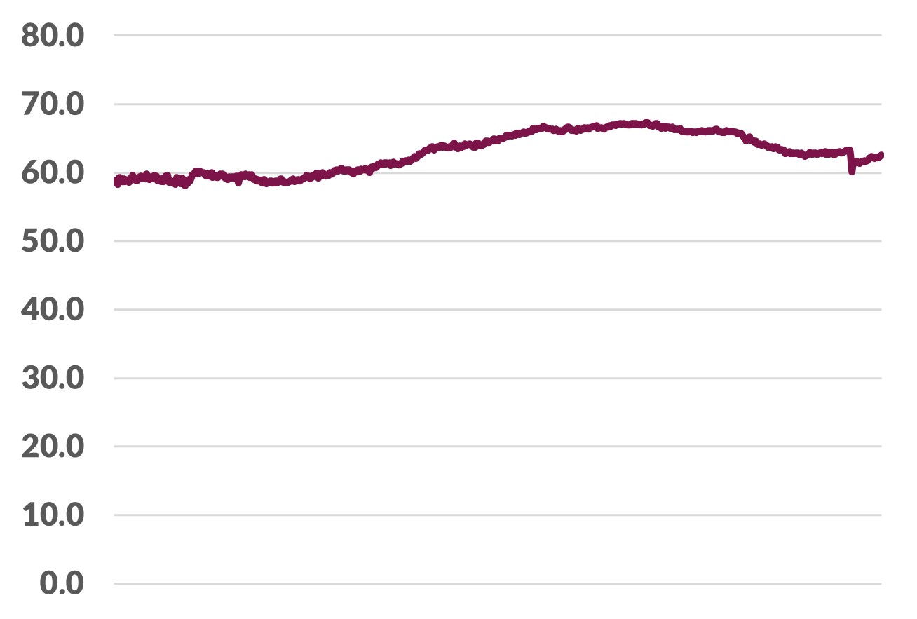
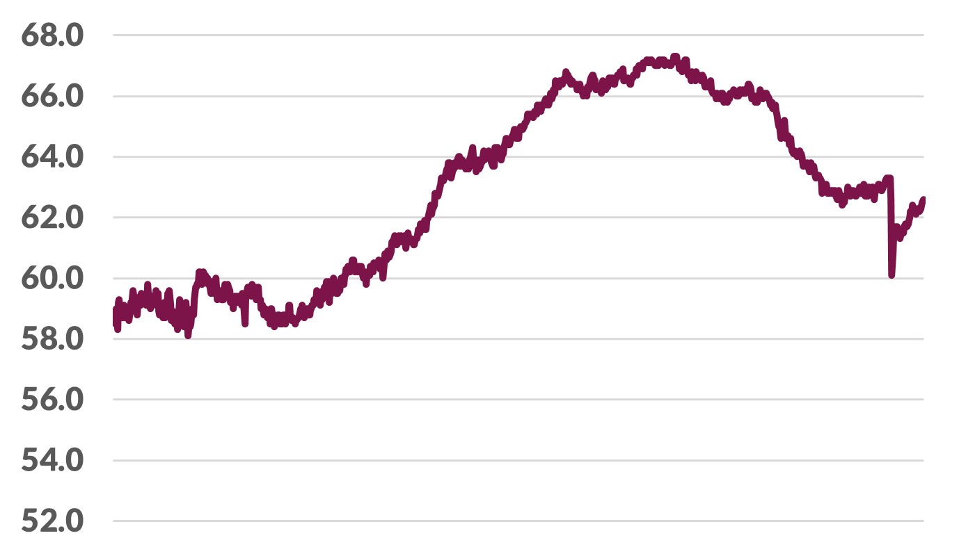
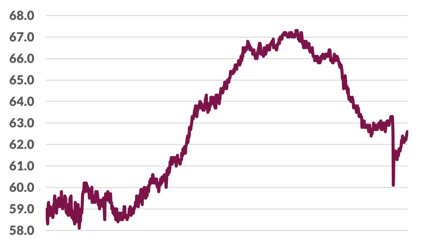
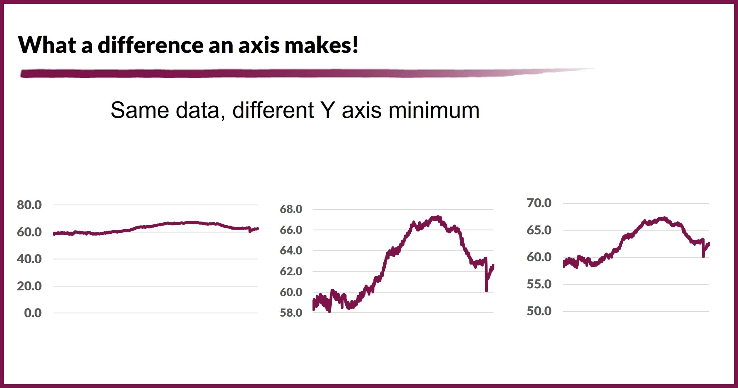
The charts in this post are all the same data on Labor Force Participation Rates, from the same time series. The only difference is the minimum value of the Y-axis. In one case, I set it at zero – which would lead to the conclusion that the rate is pretty steady – not much happening. In another case I used the values that the Federal Reserve uses – shows we’re not where near the peak, but weren’t there even before the pandemic, and in fact are trending up a bit. In the third case, I set the minimum at the lowest the rate has ever been recorded, from the 1950s, which makes the swings look even more dramatic.
What’s the point? I guess the point is that I’ve learned over the years to look for this kind of design decision. Whether it’s an automatic decision from a software program or an intentional choice, it can have a substantial impact on the story that the data tells, and I want to make sure that the decision makes sense. More than once, I’ve seen some indefensible, clearly skewed presentations – and most of the time I’ll allow that they may be inadvertent (I have a generally sunny view of humanity). Nevertheless, credibility is harmed. Then, there is a gray area, where more than one option could make sense depending on context – the problem with context is that so many visualization escape into the wild without it.
Here are the graphs shown individually with more detail