
 When are 2 (or more) charts better than 1? Last time I talked about cleaning up crowded legends by simplifying your data and direct labeling.
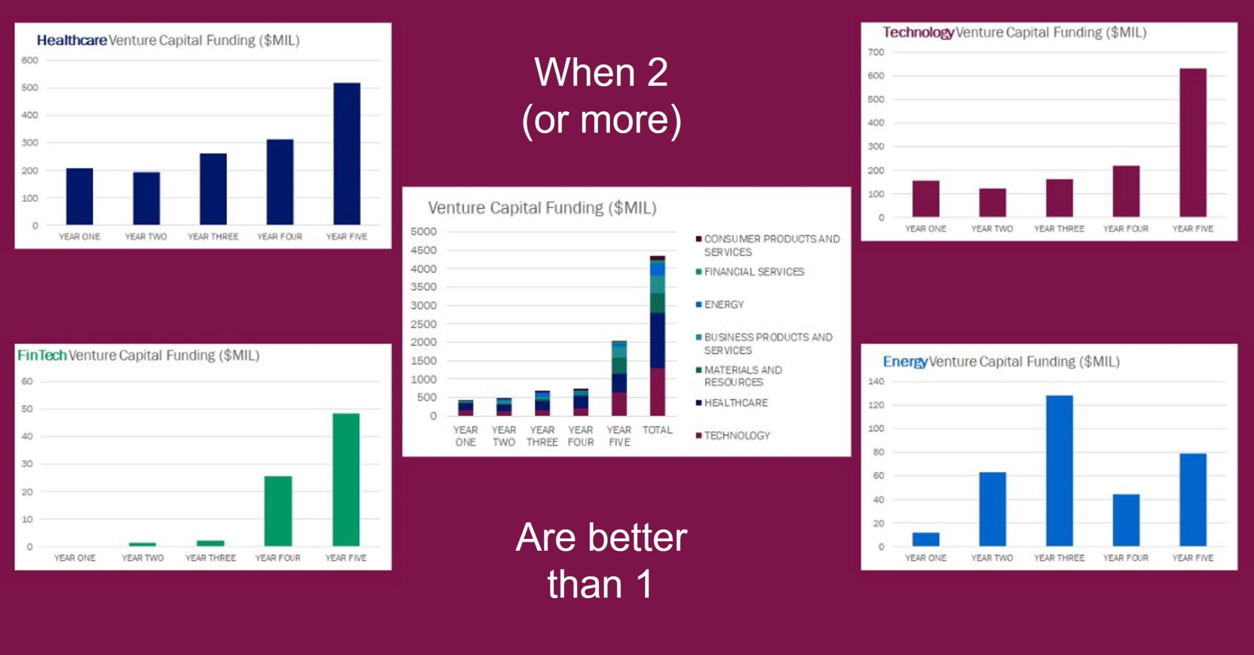
“Small multiples” are another great solution for crowded economic development charts. Just break your data series into individual charts and show them side by side or cascaded for much greater clarity. Of course, there are times when more clarity could reveal something you’d rather not highlight, but better you see it first than someone else discover it for themselves and wonder why you’ve been hiding it.
Sometimes there is a concern about fitting lots of information on a single page, especially if it is intended as a hand-out, but you can shrink them to a smaller size than a compound chart and still see the trend. And honestly, if you are finding yourself cramming lots of stuff in to a single page, you might be creating a cheat sheet for yourself, not an information piece for a prospect.
There are at least two other situations that lend themselves to small multiples – as an alternative to tables, and when your line charts have one series that is so different from the others that it floats far above or below the rest. I’ll show you examples of those, and some alternatives, the next time.