
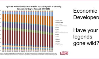
Have your Legends gone Wild?
Redesign Your Data I’ve been reading and making a lot of charts lately , and it’s made me remember the limitations of legends. This is another area where the default settings on your spreadsheet program may not be serving you well. My...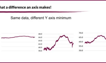
What a Difference an Axis Makes
Redesign Your Data I’ve been thinking a lot about Labor Force Participation Rates in preparation for a couple of workforce class sessions I’m preparing, and as we nerds do, I got to playing with the data. As I was looking at...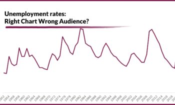
Right Chart, Wrong Audience?
Redesign Your Data If you are working with data visualizations for economic development, remember that the perfect design isn’t perfect if you use it with the wrong audience. Take unemployment – a downward trending graph,...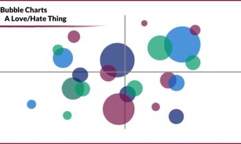
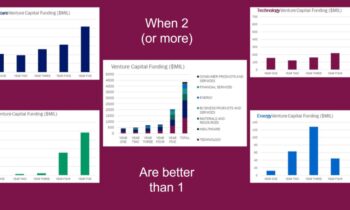
A Few of My Least Favorite Things – #3
Redesign Your Data I have a real love-hate relationship with these bubble charts, at least as they are commonly seen and used in economic development. OK, really, mostly a hate relationship. That’s not because they are a bad way...